Disclaimer:
This article is an independent UX copywriting exercise created for educational and portfolio use. I am not affiliated with Walmart or Spark Driver.The screens used are based on publicly available material. The goal is to practice identifying microcopy opportunities. As well as proposing solutions to support Walmart’s Spark Driver users.
This content is not sponsored, endorsed, or reviewed by Walmart.
David Ogilvy, the advertising legend, is claimed to have once advised: “write as if your audience is in a hurry, frustrated, and quite confused.”
That mindset is essential for UX and communications copy, especially when writing for mobile users working in last mile delivery.
Mobile delivery drivers often work under pressure, with limited time and attention. Every button, label, and message needs to count.
Walmart’s Spark Driver app is thoughtfully designed1. However, for all products at scale, there are moments where language can do more to remove ambiguity, reduce friction, and build trust.
This article reviews a few touchpoints in the app where microcopy can better align with drivers’ goals and mental states.
Approach
Each copy section analysis is structured using the following template:
-
📍 Screen Context: Where the screen appears and what the user is doing.
-
🎯 User Goal / State: What the user wants or is feeling.
- 🧩 Current Copy / 🛠️ Proposed Copy: What’s shown vs. what’s suggested.
- 🧠 Rationale: Why the change improves UX.
Key Microcopy Touchpoints
1. Parking Spot Selection

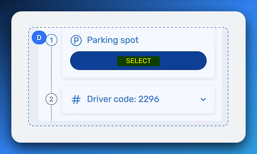
📍 Screen Context: Appears after the driver arrives at the store. Their next step is to choose a parking spot to alert store staff that they’re ready.
🎯 User Goal / State: Driver wants to quickly check in so the associate can locate them. They’re likely waiting in the car and ready to go.
🧩 Current Copy: SELECT
🛠️ Proposed Copy:
CHECK-INCHOOSE SPOT
🧠 Rationale:
- While the Parking Spot label offers some context,
SELECTfeels somewhat digital, sterile, and detached from the real-world action the driver is taking.
CHECK-INsignals the purpose of the step, not just the interaction. It also aligns with Walmart’s customer-facing curbside flow and reinforcing familiar patterns.CHOOSE SPOTis warmer and more grounded in everyday language. It reflects how people naturally talk and think. “I need to choose a spot,” not “select a value.” It emphasizes the interaction itself and aligns better with how drivers think about the task.- Small shifts like these reduce mental friction and create a smoother and easier experience for users who are pressed for time.
2. Order Status Timeline

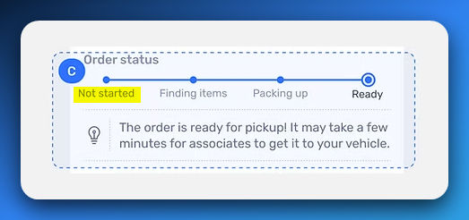
📍 Screen Context: Timeline view showing order progress inside the store.
🎯 User Goal / State: Driver wants to quickly understand whether the order is actively being prepared or delayed.
🧩 Current Copy: Not started
🛠️ Proposed Copy: Preparing
🧠 Rationale:
Not startedcan sound inactive and cause unnecessary concern.
Preparingis a neutral term commonly used in delivery apps like Domino’s, providing clearer expectations. The step’s segment indicator can be shown as inactive if the preparation has not begun.- This change reduces friction for multitasking drivers who rely on quick and intuitive visual cues.
3. Initiating Order Pickup

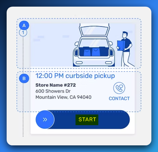
📍 Screen Context: Before beginning the pickup process.
🎯 User Goal / State: Driver wants to confidently mark the start of their trip to the store, signaling they are en route.
🧩 Current Copy: START
🛠️ Proposed Copy:
START TRIPBEGIN PICKUPHEAD TO STORE
🧠 Rationale:
STARTalone is too vague and doesn’t clearly communicate what is starting.START TRIPorHEAD TO STOREclearly indicate the driver is beginning their journey to the store.- Clear, task-specific copy sets proper expectations for drivers and reduces uncertainty before the next step, which is confirming arrival.
💭 Since the next screen uses Confirm Arrival, these options create a natural, intuitive flow from starting the trip to arriving at the store.
Scanning Order Labels

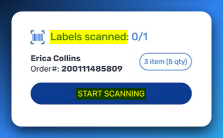
📍 Screen Context: After arriving, the driver is prompted to scan order labels to confirm pickup order(s).
🎯 User Goal / State: Driver wants to confirm the correct order is being picked up and complete the handoff without confusion.
🧩 Current Header Copy: Labels scanned
🛠️ Proposed Header Copy: Order scanned
🧩 Current CTA Copy: START SCANNING
🛠️ Proposed CTA Copy: SCAN ORDER LABELS
🧠 Rationale:
- Using
Orders scannedclearly ties the label to the order and avoids confusion about scanning individual items.
- The CTA copy is direct and instructs the driver exactly what to do next.
- Consistency between header and button copy reduces cognitive load and aligns expectations.
- Reduces possible misinterpretation (e.g., needing to scan individual item barcodes).
💭 Additional Note:
Progressive disclosure (e.g., a tooltip or camera overlay note) could clarify what should be scanned - an order label, not individual items.
Testing & CTA Design Considerations
📊 Why These Proposals Should Be Split-Tested
While based on solid UX principles, these copy changes must be A/B tested before full rollout. Effective UX writing is measurable and its impact should be validated by real user behavior.
Levels of Testing
-
Microcopy Tests
-
Does “Begin Pickup” lead to faster tap-throughs than “Start”?
-
Does “Check In” reduce errors compared to “Select”?
-
-
Flow-Level Tests
-
Do revised terms improve clarity across the pickup process?
-
Does consistent language reduce support requests or reduce task abandonment?
-
Key Metrics to Track:
-
Tap-to-task completion time
-
Frequency of re-navigation or repeated taps
-
In-app support requests
-
Wait time on key screens
-
Driver-reported confusion or satisfaction
🔠 UPPERCASE CTAs: A Readability Challenge
Spark Driver’s all-caps CTAs like START and SELECT may increase visibility but reduce readability and slow comprehension - critical drawbacks for busy mobile users.
Why Uppercase Slows Reading
-
Uppercase letters lack the unique shapes of lowercase letters, making words harder to recognize quickly.
-
Most reading happens in mixed case, so all caps demands more cognitive effort.
-
Eye-tracking studies show more and longer fixations on all-caps words, slowing reading speed.
Research confirms mixed case improves legibility and reading speed, especially on small screens or under time pressure (Tinker, 1985; Bernard et al., 2001).
Impact on Spark Driver
-
Drivers working under pressure need fast, clear CTAs. All caps adds friction and can feel aggressive.
-
Clear, readable copy reduces stress and speeds task completion.
Industry Standards
Top delivery apps like Uber Eats, DoorDash, and Instacart use sentence or title case CTAs, avoiding all caps.
Recommendation
Switch to sentence or title case CTAs and A/B test their effect on readability, tap speed, and driver comfort.
Conclusion: Designing for the Real World
In gig work apps, every second counts. Drivers operate under pressure, often while multitasking. Microcopy in these moments should be:
-
Clear and goal-specific
-
Consistent with user expectations
-
Transparent about the consequences of each action
Effective UX writing doesn’t just inform - it guides, reassures, and streamlines. It earns trust by making the complex feel manageable.
With experience in technical documentation, helpdesk systems, and UX writing for logistics-adjacent platforms, I specialize in bridging system logic with human behavior.
Clarity builds momentum. Copy is how it starts.
Footnotes
-
Screens sourced from the portfolio of BeiBei Zhang, Staff Product Designer at Walmart. Check out her excellent work at beibeidesign.com/spark-driver. ↩